This page is a list of Design decisions made by Spotify that I consider shitty. I'm sure some of them were only A/B tested, coming and going silently, but some have lingered for years. In any case I have been subjected to all of these personally.
See also: Dear spotify product manager by Lu Wilson, Redesigning Spotify by Juxtopposed
Unable to Remove DJ Shortcut On Desktop
On desktop they have added a link to the DJ feature at the top of Your Library, below pinned playlists. Despite not being a playlist (nor a feature I use), it continues to appear even when you have set the filter to only show playlists. As far as I know it cannot be removed? But it can be pinned. Despite already being permalocked to the top.
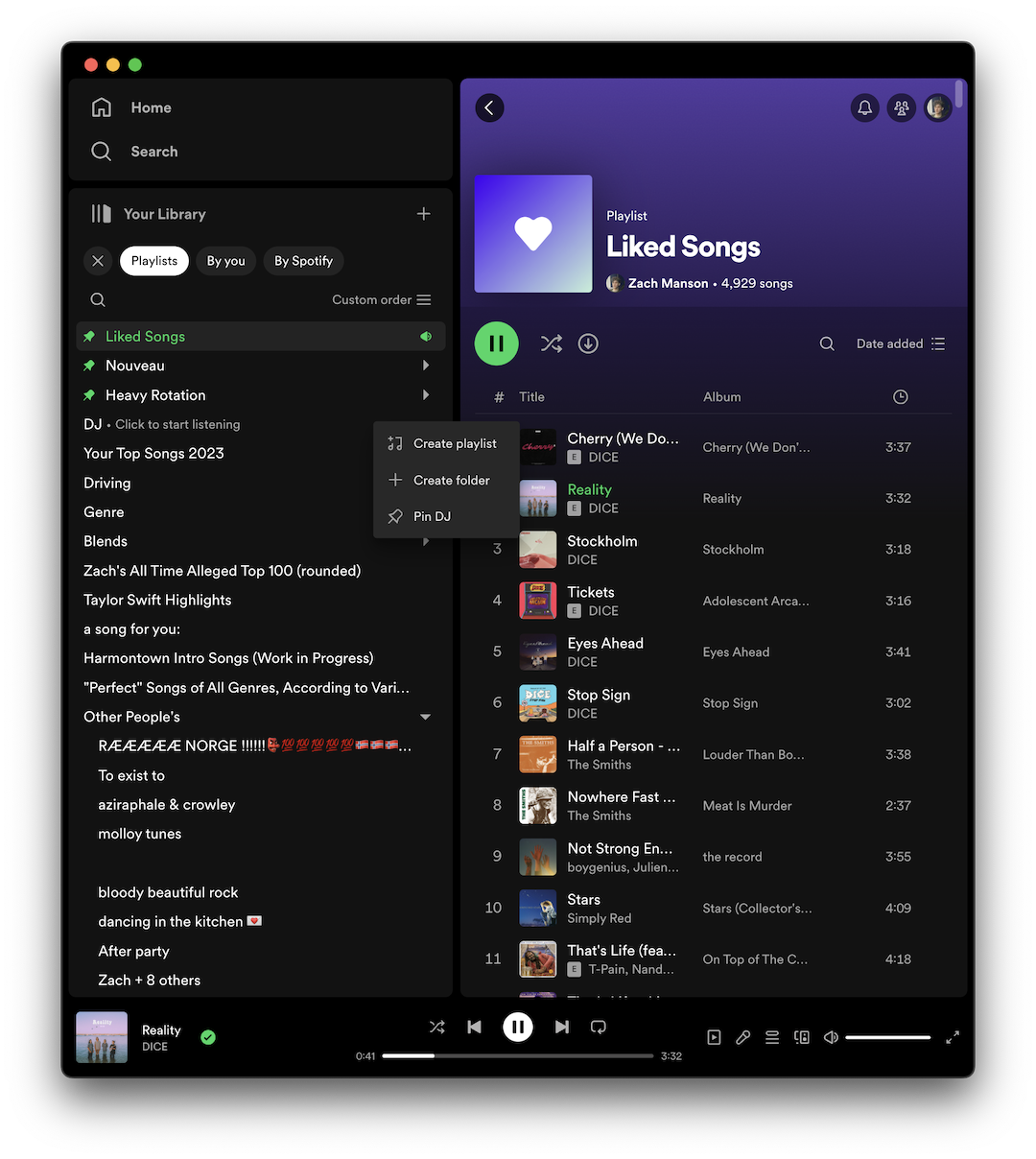 The day after writing the previous paragraph, I noticed they added the DJ to the same section in the mobile app. In the mobile app a long press on the DJ icon does shows you an option to hide it, which seems to sync across all my devices. Why is this option not available in the desktop client!
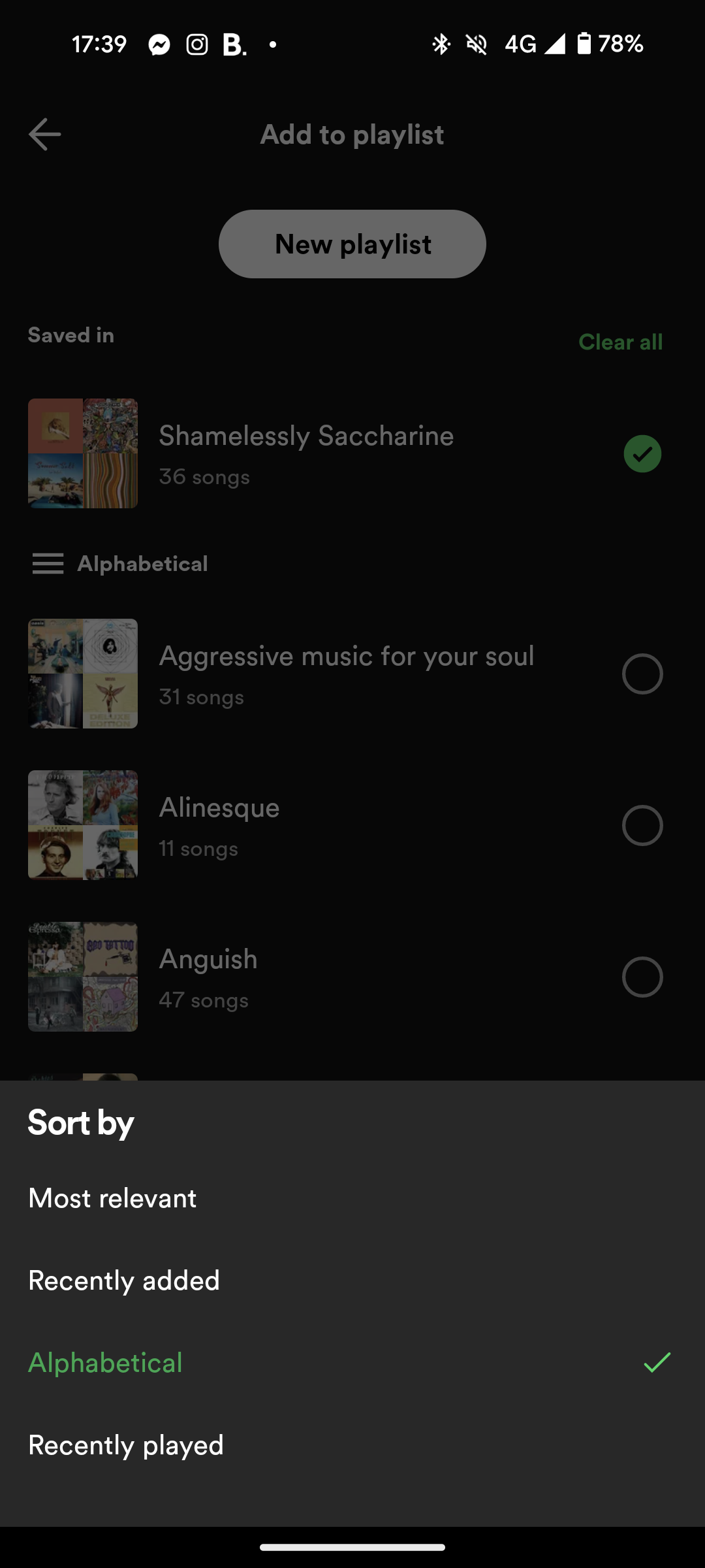
Custom Playlist Sorting
For as long as I can remember you can order the playlists you have created/followed in any order along the left side of the desktop app. You can even put them in nested folders which is fantastic. I have many playlists organised into folders in particular orders. I know how to get to the playlist I want quickly because I have put it in a particular place. This custom order and "Recently played" are the only two i would ever want.
Spotify seems to hate this use case. To my knowledge its never been possible to rearrange order of playlists on the mobile app, only the desktop client.
When you attempt to add a song to playlist on mobile, there isn't even an option to sort by recently played anymore. This is diametrically opposed to desktop, where the right click menu will ONLY allow you to sort by custom order.
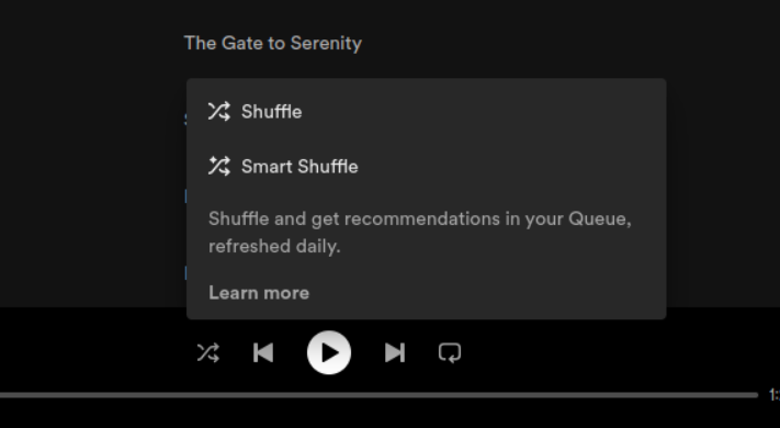
Smart Shuffle Button Cycle Lock
Spotify has added a feature called Smart Shuffle that works like normal shuffling, but also adds recommended songs in-between ever few tracks in the queue. On paper I like this feature, though I have never found myself actually using it. I was introduced to it through the following infuriating UX.
I go the the Now Playing screen on the Android Spotify client. The playlist I am listening to is currently set to shuffle (regular shuffle), but I would like to turn off regular shuffle. I press the button with a shuffle icon, which has for 10+ years been a single toggle that would instantly take effect. Instead of a simple 2 option toggle, I find that it has been converted in to a 3 option cycle button, where pressing it cycles through the options of Linear -> Shuffle -> Smart Shuffle -> Linear. I can see the thinking behind this decision, but it breaks muscle memory established all other music players for decades. That is not my issue though.
When you click the button and move the state from Shuffle to Smart Shuffle, the application begins loading the Smart Shuffle recommendations which means it must query Spotify servers, which is an operation that takes multiple seconds. While this occurs, the button with a Shuffle icon becomes a button with a loading spinner, and becomes unclickable. I must wait multiple seconds before I can turn off Smart Shuffle.
Linear -> Shuffle -> Loading (multiple seconds) -> Smart Shuffle -> Linear
This is deeply infuriating. I never even wanted to use Smart Shuffle in the first place and now I must wait for it.
This occurred every time I wanted to turn off Shuffle. Which is a lot.
As of 2024-01-21, this loading state of the button appears to have been removed, thankfully.
Smart Shuffle Cycle Order
Oh sorry did I say the order was Linear -> Shuffle -> Smart Shuffle? Its actually Linear -> Smart Shuffle -> Shuffle. Wait no go back. Wait... it's a different order on my phone vs on desktop? This is real wtf.
Smart Shuffle Popup
I clicked shuffle once and this came up. Thankfully it only ever appeared once on 2023-11-14, but it never should have in the first place.
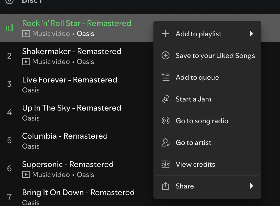
Overflow Menu Loading
For some godforsaken reason, the overflow menu for a track sometimes appears to require a network request before it can show. If this request is slow, it will show a loading spinner in place of the menu, until the server responds. Or in some cases, the overflow menu will fail to load entirely. This is insane, since for the most part, the options on this menu are identical. This is doubly insane since the menu can load without any issue what-so-ever in offline mode.
I have only ever experienced this issue on the Android mobile app, which for many years did not support swiping on a song to queue a song. At this time you were only able to queue a song. through the overflow menu, which often times meant waiting multiple seconds for menu to appear. God forbid you wanting to queue multiple songs in a row. Thankfully you can now bypass the menu loading by swiping a track to the right.
Oh wait!
Can't Swipe to Queue on Blend Playlists
On Android you cannot swipe to queue a playlist if the playlist is a blend playlist??? Why would this screen use a different component to represent a list of songs to every other screen in the app?
Secret Sliding Menu
This one I only just noticed now while typing this post. There is a sliding menu that appears if you click on your profile picture in the corner of any of the 3 main screens. It seems a bit sparse, like it would be better suited to being a drop down? In any case this menu can actually be accessed from any playlist folder screen as well, despite there being no indication of this. This only seems to work on playlist folder screens though, as it doesn't work for any other subpages.
This one was annoying as I accidentally triggered in when attempting to swipe in from the left to go back a screen.
Can't Swipe Up to Access Player
On Android you can swipe down on the player interface but you cannot swipe up to reveal it. When you attempt this you will almost definitely skip the song that is currently playing, since the minimised version of the player only detects left and right swipes.
Top Bar Alignment
Who the fuck let this happen.

Liked Songs Filters Are Actually a Playlist
For years, if you used the text filter on your Liked Songs and then played one of the songs, the queue would only populate with songs that matched that filter. This could be useful for only listening to a particular artist within your Liked Songs, but was usually just annoying.
As of 2024 it appears this behaviour has been removed.
Search Results Are Actually a Playlist
Similar to the previous issue, if you searched for a song using the search tab, and then played one of the results, the queue would populate with all the other search results meaning you would hear the same song repeated several times, or covers, or random other tracks with similar names.
As of 2024 it appears this behaviour has been removed.
Useless Music Video Indicator
They have added a subtitle and icon for songs with music videos, which looks like it is clickable or has some feature attached to it. But it just... doesn't?
Upcoming Complaints
- Rapidly toggling through Shuffle button states can cause the cycle to desync in strange ways
- Spotify (regular) Shuffle algorithm has some problems