This is a list of problems with the Kinde interface.
Useless Dropdowns
This dropdown should list the environments instead of revealing a button to take you to a page that lists the environments. This is an unnecessary second click.
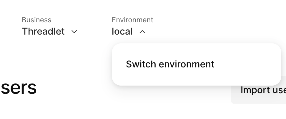
This also means you are unable to switch environment without losing the page you are on.
Unclickable Icons
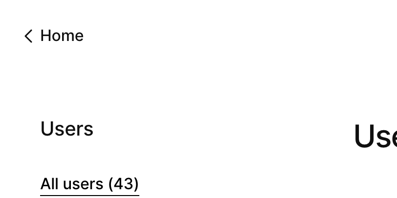
For some reason the left facing chevron is not clickable, only the word "Home" is.
Bizarre Breadcrumbs
When you go to the "Users Profile" screen, the top left back icon doesn't take you back to the "Users" screen, but remains a "Home" button.
The only way to navigate back is the the small grey "User" text above the user's name.
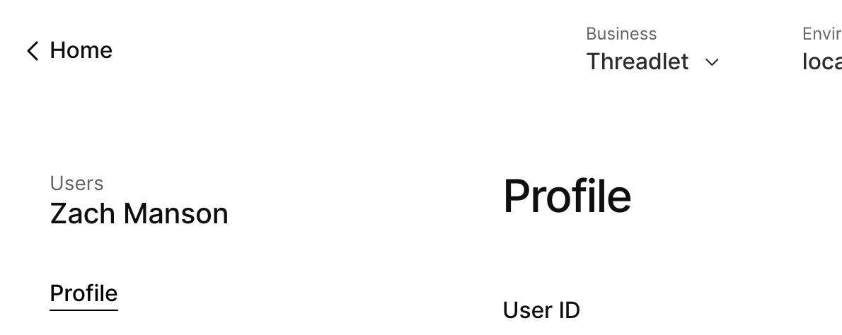
This is something that almost all basic websites can get right. Breadcrumb navigation or consistent back behaviour would be vastly preferable here.
There is little consistency between parts of the interface that are clickable and those that are not. This makes navigating quite difficult.